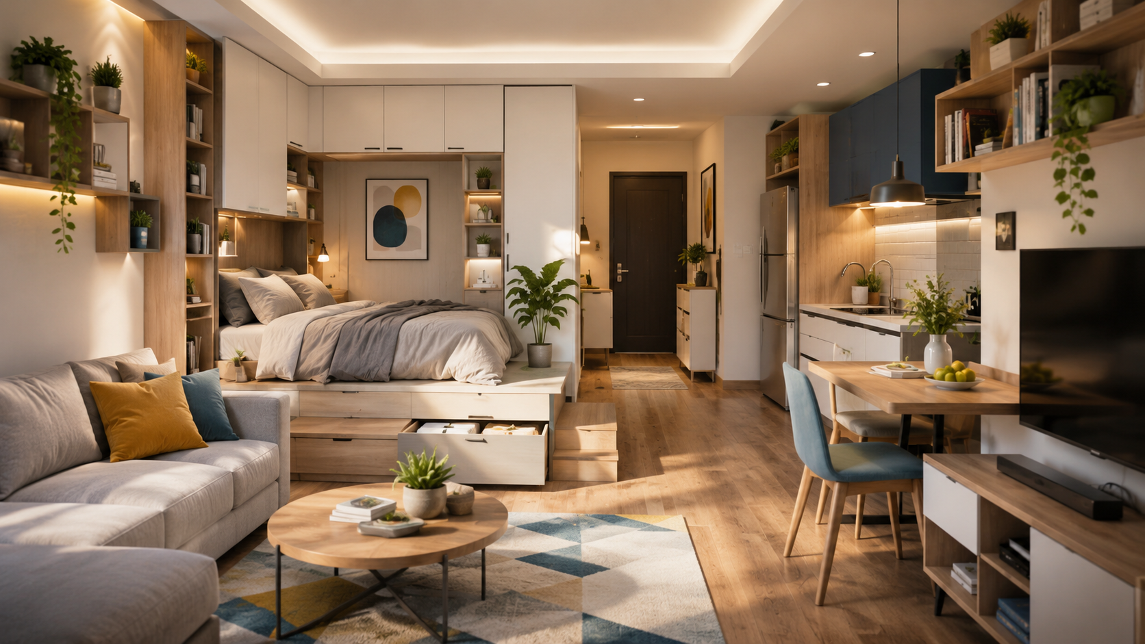
The colors and materials you choose have a major impact on how a compact living space feels. The right combination can make rooms appear brighter, more spacious, and more comfortable while maintaining a cohesive and stylish appearance.
Quick Overview
- ✓ Select light-reflecting colors
- ✓ Balance textures carefully
- ✓ Create visual continuity
- ✓ Avoid excessive contrast
- ✓ Choose practical materials
Introduction
Understanding how to choose colors and materials for a compact living space is one of the most effective ways to improve both appearance and functionality. In smaller homes, every design decision becomes more noticeable because there is less room for visual distractions. Color choices influence brightness, mood, and perceived space, while materials affect durability, maintenance, and overall style. By combining thoughtful color palettes with practical materials, you can create an environment that feels open, welcoming, and comfortable without making the space feel busy or overwhelming.
Build a Color Palette That Feels Open
Soft Neutrals
Light beige, warm white, and subtle gray tones help rooms feel airy and spacious.
Muted Earth Tones
Natural shades provide warmth without making a room feel visually heavy.
Gentle Greens
Soft green accents create a calm atmosphere while maintaining brightness.
Controlled Accent Colors
Use stronger colors sparingly to create interest without overwhelming the room.
How to Choose Colors and Materials for a Compact Living Space
Prioritize Consistency
Using similar color tones throughout connected spaces helps create visual flow. Consistency reduces visual interruptions and allows rooms to feel larger than they actually are.
Mix Materials Carefully
Combining wood, fabric, glass, and metal can add depth and personality, but limiting the number of dominant materials helps maintain a clean appearance.
Materials That Work Well in Small Spaces
Natural Wood Finishes
Light wood tones add warmth while keeping interiors bright and welcoming.
Glass Surfaces
Glass tables and partitions allow light to move freely through a room.
Reflective Finishes
Subtle reflective surfaces can help distribute light and increase openness.
Durable Fabrics
Practical fabrics that are easy to clean are ideal for frequently used furniture.
Color and Material Comparison Table
| Option | Main Benefit | Visual Impact | Maintenance |
|---|---|---|---|
| Light Wood | Warmth | Bright | Low |
| Glass | Openness | High | Medium |
| Neutral Paint | Versatility | High | Low |
| Soft Fabrics | Comfort | Medium | Medium |
| Metal Accents | Modern Style | Medium | Low |
| Stone Surfaces | Durability | Medium | Low |
Step-by-Step Selection Process
Instead of introducing many different colors, use varying shades of the same color family. This creates visual depth while maintaining a calm and spacious appearance.
Common Mistakes to Avoid
- Using too many bold colors in one room.
- Mixing excessive material types.
- Choosing dark finishes for every major surface.
- Ignoring natural lighting conditions.
- Creating strong visual contrasts throughout the space.
- Selecting materials that are difficult to maintain.
Quick Design Checklist
Helpful Resource
Helpful Resource: National Park Service – Design & Preservation Resources
This educational resource offers valuable guidance on materials, finishes, and design principles that can support informed interior design decisions.
Frequently Asked Questions
What colors make a small living space look larger?
Light neutrals, soft earth tones, and gentle shades that reflect light generally create a more spacious appearance.
Can dark colors work in compact spaces?
Yes, when used as accents or balanced with lighter tones rather than dominating the entire room.
How many materials should I use in one room?
Limiting the primary materials to a few complementary options helps maintain visual harmony.
Are reflective surfaces useful in small homes?
Yes. Glass, mirrors, and subtle reflective finishes can help distribute light and improve openness.